The Ultimate Guide to Bedroom Color Combinations (2026)
You want a bedroom that instantly feels like a calm, cozy retreat. I’ll share practical color combinations—like soft grays with warm whites, muted greens with natural wood, and deep jewel tones with gold accents—that set a relaxing mood without losing style. Pick a main neutral or muted color, then add one or two accents to control the room’s energy and coziness.
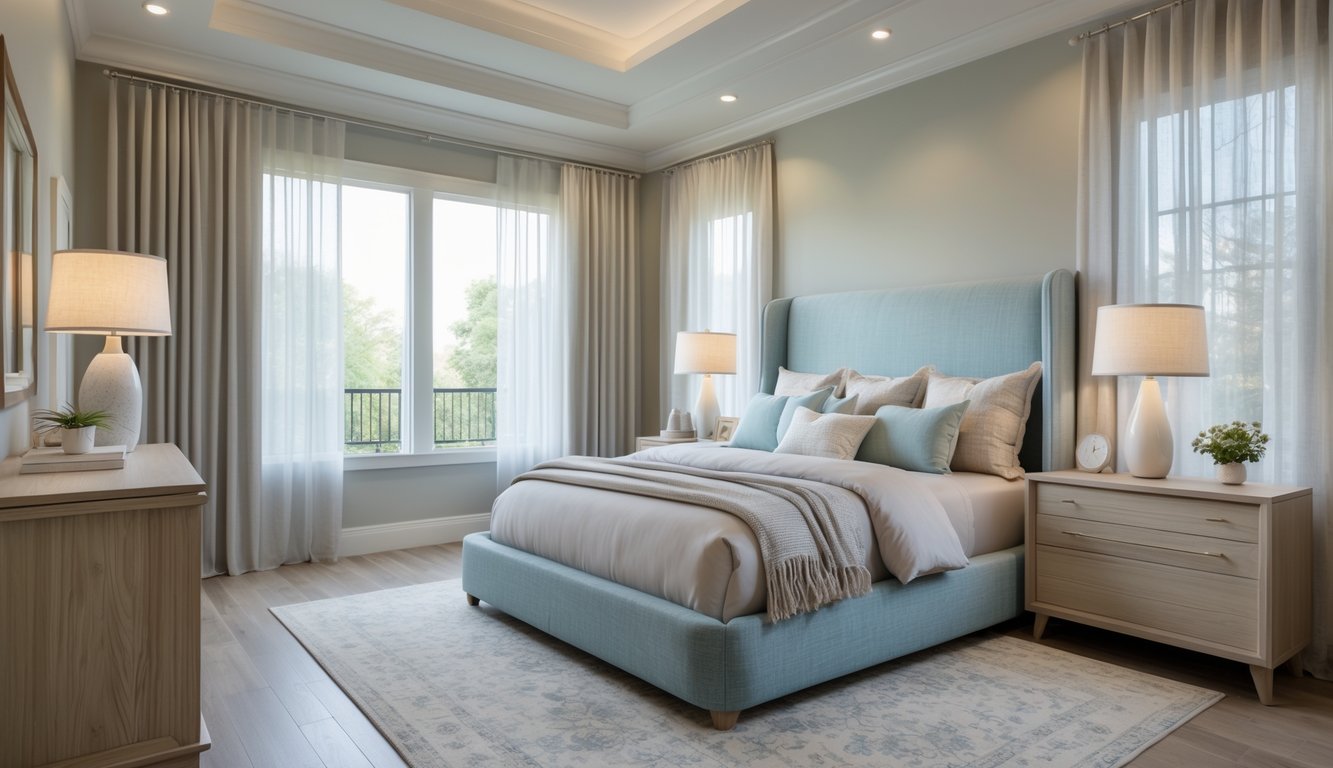
I’ll break down how color affects sleep and mood, share color schemes that actually work, and give you simple ways to use accent walls, textiles, and finishes to make your palette feel personal.
Understanding Bedroom Color Psychology

I look at how specific hues, undertones, and materials affect sleep, mood, and comfort. You’ll get clear advice on color effects, when to pick warm or cool undertones, and how lighting and natural textures change what you see.
How Colors Influence Sleep and Relaxation
Colors impact heart rate, alertness, and even how warm or cool a room feels. I like cool blues and muted greens for bedrooms because they slow things down and help you relax. Both research and design experience show these colors help people fall asleep faster and get better rest.
Skip bright reds, yellows, and oranges on main walls—they can keep you awake. Use those bold colors in small doses, like throw pillows or art, for a pop of energy without overwhelming the space.
Pale, less saturated colors reflect light softly and feel restful. Deeper, smoky tones can feel cozy if you soften them with plush bedding and warm lighting, but they might feel cramped in rooms without much natural light.
Choosing Warm vs. Cool Undertones
Undertones change a color’s vibe. I go for warm undertones (soft beige, warm greige, butter yellow) when I want a snug, inviting feel. Warm undertones make big rooms feel cozier and more relaxing.
Cool undertones (blue-grays, sage, slate) add calm and clarity. I like cools in smaller bedrooms to help them feel bigger and to ease nighttime wind-down. Mixing undertones—like cool blue with warm wood floors—brings balance.
Match undertones to your furniture and even your skin tone. If you’ve got mahogany or rich wood furniture, warm undertones pull the look together. If your space has light oak or rattan, cool undertones give an airy, modern feel. Always test swatches at different times of day to catch subtle shifts.
The Role of Lighting and Natural Textures
Lighting totally changes color. I always check paint swatches in morning sunlight, midday, and at night with lamps. Cool paints can look dull under warm bulbs, while warm colors glow under soft lighting.
Natural textures like linen, wool, and wood add warmth and keep cool tones from feeling sterile. Pairing natural textures with warm paints keeps things from getting too sweet or heavy.
Layer your lighting: use soft overhead lights, dimmable bedside lamps, and warm accent lights. Add tactile elements like a jute rug, wool throw, and wood tables to create a relaxing atmosphere that feels put together.
Popular Bedroom Color Schemes for Maximum Coziness
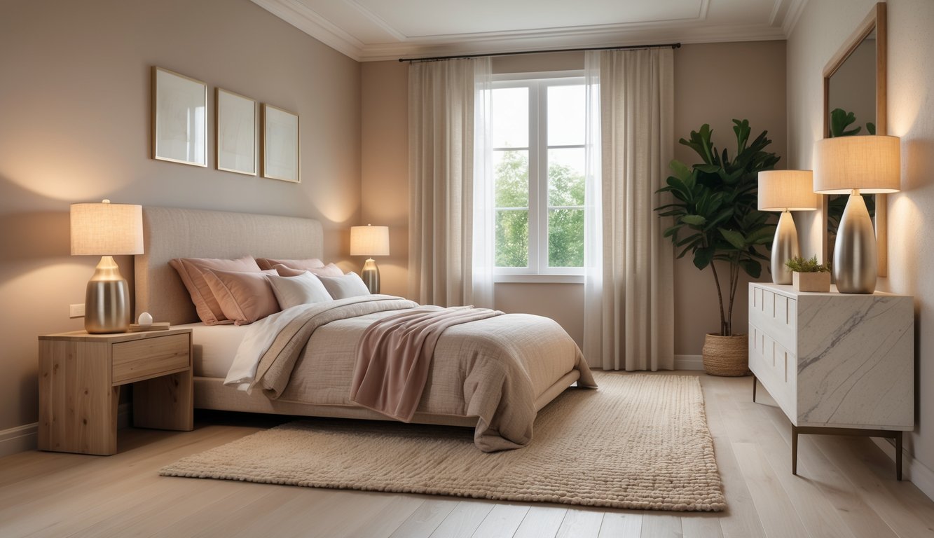
I look for palettes that balance warmth and calm so a bedroom feels restful right away. Each combo below has a main color, a neutral to support it, and styling moves that deliver cozy results.
Soft Green and Warm White
Soft green—like sage or muted olive—makes a calming wall color. I pair it with warm white trim and ceilings to keep the space bright but not stark. Warm white (creamier than pure white) bounces light gently, so the green stays tranquil.
Natural wood furniture and woven textiles boost the warmth. A mid-tone wood bed or bedside table grounds the green and keeps it from feeling cold. For accents, I use off-white linens and a darker green pillow for depth.
Pro tips: go for matte paint to hide wall flaws, use warm white for trim to frame the space, and add a couple of plants to echo the green and keep things cohesive.
Blush Pink with Muted Gray
Blush pink softens the look; muted gray keeps things calm. I pick a blush with a beige undertone so it feels grown-up, not sugary. For gray, I like a cool or mid-tone shade that balances the pink without making the room chilly.
Put blush on an accent wall or headboard, and use muted gray for bigger items like the rug or curtains. Brushed brass or warm gold metal accents brighten the palette.
Texture is key: velvet pillows, a knit throw, and a low-pile rug add coziness. If your room doesn’t get much natural light, use more warm white lampshades to keep it feeling inviting.
Classic White and Neutral Tones
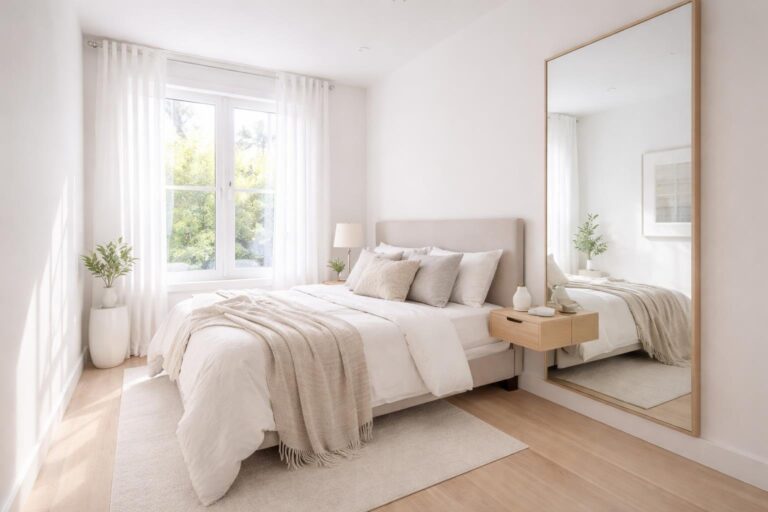
Classic white with layered neutrals never goes out of style. I start with a warm white on the walls, then layer in tan, taupe, and mid-gray in bedding and furniture. This keeps things bright but still comfortable.
I add contrast with materials: a crisp white duvet, linen or cotton throws in taupe, and a gray accent chair. Wood tones, from pale oak to walnut, add natural warmth and keep the look from feeling flat.
To keep things interesting, I mix low-contrast patterns—subtle stripes, small geometrics, or soft botanicals—and limit accent colors so the neutrals shine.
Dusty Blue and Light Gray
Dusty blue feels calm but still rich; light gray keeps the look soft and modern. I pick a dusty blue with muted tones so it always feels relaxing. Light gray works well for big areas—walls or carpet—since it reflects light and keeps the vibe cool.
I use dusty blue bedding or a headboard with light gray walls, then add warm wood nightstands for balance. Accent with brushed nickel and mixed blue and gray textiles for a layered, cozy feel.
For finishing touches, I use warm white lights and a cream throw to keep things soft and welcoming.
Creative Bedroom Color Combinations for Relaxation

I like practical color pairings that bring calm, warmth, and interest without overwhelming your space. These combos use steady neutrals and well-placed accents so your bedroom feels restful and intentional.
Hunter Green and Mustard Yellow
I use hunter green as a grounding wall color or for a big upholstered piece like a headboard. Its deep, blue-leaning green feels moody and restful, making a bedroom feel intimate.
Mustard yellow works best as an accent—think pillows, a throw, or a single chair. Pick a muted, ochre-toned mustard for warmth and contrast that doesn’t compete with the green.
Pro tips:
- Paint: hunter green on an accent wall behind the bed; keep other walls a warm off-white.
- Textiles: mustard velvet cushion, cream linen duvet, and natural wood bedside tables.
- Metals: matte brass or aged gold hardware to tie it all together.
Soft Sage Paired with Cream or Beige
I love soft sage for a soothing, airy backdrop. It’s less saturated than hunter green and works well in rooms with moderate natural light.
Pair sage with cream or warm beige for a cozy, soft vibe. Cream on trim and bedding lifts the look, while beige rugs or baskets add texture.
Pro tips:
- Paint: soft sage walls with cream trim for sharp, clean edges.
- Layers: beige wool rug, cream sheets, and sage throw pillows for a tonal look.
- Accents: add plants and light wood to boost the calming green effect.
Bright Blue and Subtle Accents
I use bright blue as an energizing yet calming choice when used in moderation. Try it on one wall, the ceiling, or big textiles for a fresh, spa-like feel.
Keep accents soft: pale gray, off-white, or sand tones prevent the blue from feeling too strong. Add a muted chartreuse cushion or a pale mustard lamp for personality without losing the calm.
Pro tips:
- Placement: bright blue on a headboard wall or bedding; pale sand on the other walls.
- Balance: white bedding and light wood furniture to soften the look.
- Details: add a few subtle accents—linen curtains, a gray throw, and a small mustard or green pillow to tie it all together.
Designing with Accent Walls and Bold Statements
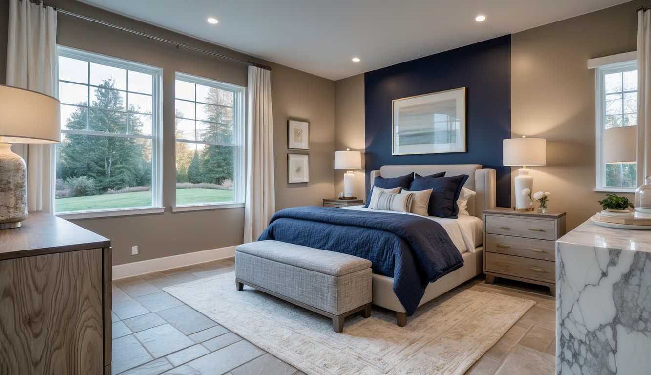
I show how a single bold wall or color choice can totally change a bedroom’s mood and focal point. Where you place the color, the paint finish, and what you pair it with all decide whether a bold statement feels cozy or too much.
Bedroom Accent Wall Ideas
I usually pick the wall behind the bed for an accent wall—it frames the headboard and anchors the room. You can use paint, wallpaper, or wood paneling for different textures and looks.
- Paint: Go for matte or eggshell for a soft, cozy feel. Satin gives a bit of sheen and is easier to clean.
- Wallpaper: Pick subtle patterns or bold motifs based on your bed size and room dimensions.
- Panels: Shiplap or vertical slats add depth and look great with warm wood stains.
Keep the accent wall color within two to three shades of your other walls to avoid clashing. I like to pair bold walls with neutral bedding, a couple of accent pillows, and simple bedside lighting to keep the look intentional.
Using Deep Tones like Black and Blue
I use deep blues and blacks for drama and coziness when I balance contrast and lighting. Dark navy or charcoal on one wall creates intimacy, especially if the other walls stay light.
Place lamps with warm bulbs on both sides of the bed to keep the dark wall from feeling too heavy. Add reflective touches—brass hardware, a mirror, or a glossy table—to bounce light around.
With black or deep blue, I use soft neutrals for bedding (cream, warm gray) and add one textured throw or pillow in a complementary color for warmth and contrast.
Layering Warm Neutrals with Accent Colors
I start with a warm neutral base—taupe, greige, or warm beige—then bring in one accent color for personality. Use the accent on the wall behind the bed, a painted door, or upholstered furniture.
Stick with a consistent undertone: if your base is warm, pick warm accent hues (terracotta, olive, mustard). If it’s cool, try muted blues or dusty rose.
Texture is key: woven rugs, linen bedding, and a wool throw add depth without extra color. I like to echo the accent color with artwork or a single patterned pillow for a pulled-together look.
Expert Tips for Choosing Bedroom Paint Colors
I focus on practical choices that make a difference: durability, undertones, and how colors look throughout the day. I stick with trusted brands and always test samples in the actual room before deciding.
Best Paint Brands: Benjamin Moore, Sherwin-Williams, Farrow and Ball
I usually start with three reliable brands. Benjamin Moore gives rich pigments and consistent quality; their Aura line covers well and is easy to clean. Sherwin-Williams is widely available and a good value—Emerald and Cashmere are smooth, low-sheen, and resist scuffs. Farrow & Ball has unique, layered pigments and premium finishes; I use it for a saturated, nuanced look.
Pick the right finish: eggshell or low-sheen satin for walls gives you durability and a soft look. Ask for color cards and check lightfastness ratings if your room gets a lot of sun. If air quality matters, look for low-VOC paints.
How to Sample and Test Paint Colors
I never choose a color from a chip alone. Get 8–16 oz samples of your top two or three picks and paint big panels on different walls. Check them in the morning, midday, and at night to see how the undertones shift with light.
Use the same finish you’ll use on the full wall—sheen changes how the color looks. Take photos of the samples under your room’s lighting and next to your main furnishings. If a color clashes with bedding or a rug, try going one step lighter or changing the undertone. Keep notes of the paint names and codes so you can reorder.
Coordinating Bedroom Decor with Wall Colors
I use a simple ratio: 60–70% dominant wall color, 20–30% secondary color in big textiles, and 10–15% accent tones in pillows or lamps. This keeps the room balanced and interesting.
Match undertones, not just color names: warm beige works best with warm woods and rust accents, while cool blues pair with brushed metals and crisp whites. Use one patterned piece—like curtains or a quilt—that ties your palette together. For trim and ceiling, pick a slightly lighter or warmer version of your wall color for depth, or go with crisp white for contrast.
Final Touches: Creating a Personalized Retreat
I focus on small details that make a bedroom feel comfortable and restful. Thoughtful materials, layered textiles, and a bit of pattern mixing turn a color scheme into your own retreat.
Incorporating Natural Materials and Layers
I add natural textures to bring warmth and depth to a color palette. Try a woven jute rug, a solid oak nightstand, and linen curtains in a soft neutral that matches your wall color. These elements ground cool tones like dusty blue or gray and warm up jewel tones like forest green or mauve.
For bedding, I layer a cotton sheet, a mid-weight duvet, and a textured throw at the foot of the bed. I use two pillow types—plush sleeping pillows and smaller decorative ones in suede or boucle—for a mix of comfort and style. Plants on a windowsill or a wooden tray with a ceramic vase bring in more natural vibes without clashing with your color scheme.
Balancing Patterns, Textures, and Color Palette
I keep patterns minimal to avoid clutter. Start with a solid color for the main wall or furniture, then add one geometric throw pillow and one organic-patterned rug or piece of art. Stick to two pattern scales: a large-scale pattern for a rug or duvet, and a smaller repeat for pillows or lampshades.
Texture brings balance. Mix smooth pieces (painted furniture, glass lamps) with nubby ones (knit throws, linen pillows) and add reflective accents (brass or matte black hardware). For color, I pick one main hue, one secondary neutral, and one accent color—use them throughout textiles, trim, and accessories. Here’s a simple breakdown:
- Dominant: wall or large textile (e.g., sage)
- Secondary: furniture/trim (e.g., warm white or tan)
- Accent: pillows/art/lamps (e.g., mustard or deep navy)
I test combinations in natural light and adjust as needed—add more neutral if things feel busy, or more accent if the room looks flat.
Frequently Asked Questions
I answer common questions about color choices, sleep-friendly tones, couple-friendly palettes, top Benjamin Moore picks, and where I find inspiration. You’ll get clear examples and practical tips for paint, bedding, and accents.
What colors help create a calm and soothing bedroom atmosphere?
I like muted blues, soft greens, and warm greys for a calm vibe.
Dusty blue, sage green, and greige (a warm gray-beige) keep things relaxed but stylish.
Stick with low saturation and lighter shades.
Pair painted walls with white or cream trim and natural-wood accents for a laid-back feel.
Which shades are ideal for a warm and inviting bedroom vibe?
I go for warm neutrals like tan, warm taupe, and creamy beige for coziness.
Burnt orange or terracotta work well as accents alongside neutrals.
Soft peach and muted mustard also add warmth without being too bold.
Use textured textiles—wool throws or linen curtains—to boost the inviting feel.
How can I choose bedroom colors that promote better sleep?
I pick colors that help you wind down: muted blues, soft greens, and warm neutrals.
Skip super bright or highly saturated colors, especially near the bed.
Think about your room’s light and exposure: cooler colors work in sunny rooms; warmer tones suit dimmer, north-facing spaces.
Test paint samples on all walls and check them at night under your usual lighting before choosing.
Can you suggest some cozy bedroom color schemes for couples?
I like a base of warm neutral walls (greige or soft taupe) with coordinated accents.
Option 1: Sage green wall + cream bedding + walnut furniture.
Option 2: Dusty blue walls + warm white trim + rust or terracotta throw pillows.
Option 3: Deep charcoal accent wall + soft mauve bedding + brass hardware.
Pick one shared accent color, then let each partner add personal touches with textiles and art.
This keeps things cohesive and lets both of you express your style.
What are some popular calming paint colors from Benjamin Moore for bedrooms?
I reach for Benjamin Moore’s soft neutrals and muted tones.
Favorites include Classic Gray, Revere Pewter, and Pale Smoke for calm, understated walls.
Saybrook Sage and Quiet Moments are great for gentle green or blue with low saturation.
Always sample swatches in your room to check undertones in your lighting.
Where can I find inspiration for a bedroom color palette that feels relaxed and peaceful?
I check out design sites, trend roundups, and designer portfolios for curated palettes.
I like using lists of calming color schemes, articles on cozy color pairings, and real-life examples of soothing bedroom paint colors.
I also save photos from social media and bookmark rooms that mix paint, bedding, and wood tones I like.
After that, I make a small mood board with samples so I can see how the combinations look in my actual room.