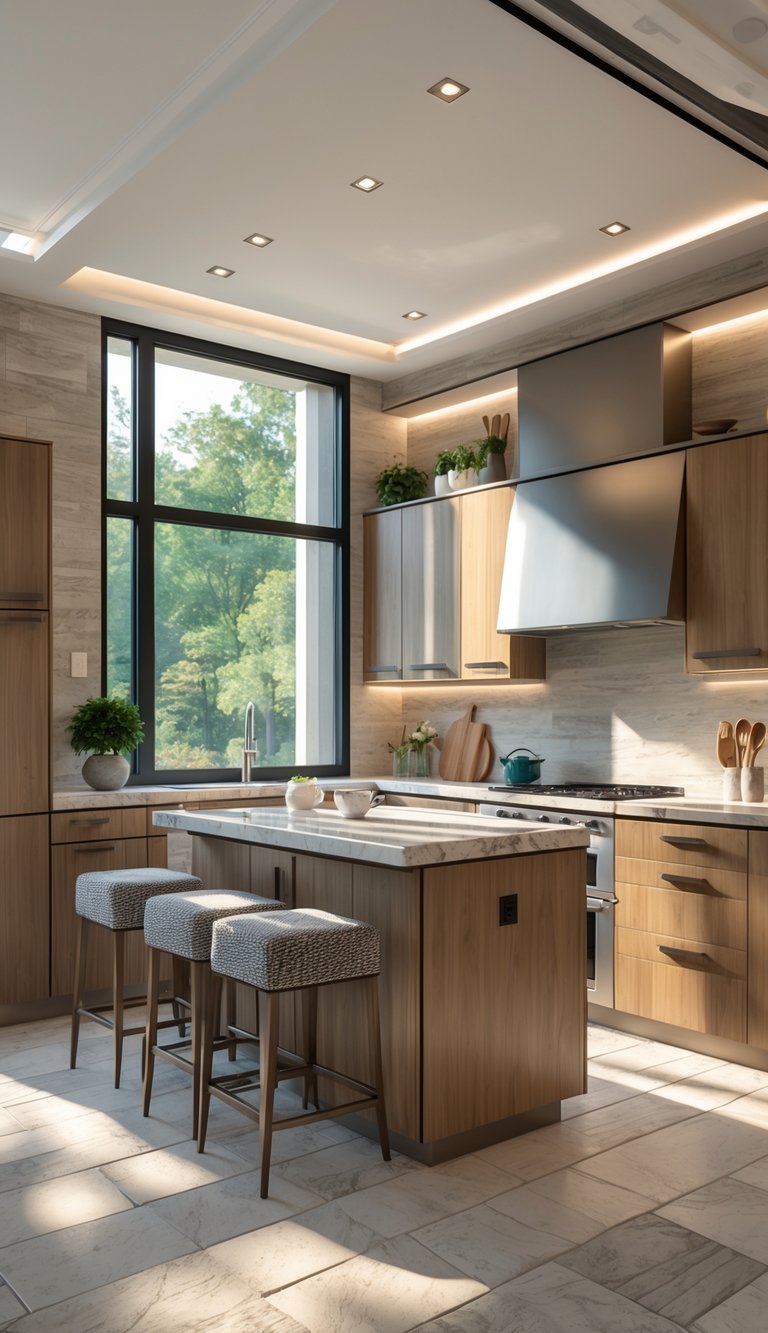
How to Choose the Best Kitchen Cabinet Color for Your Home (2026)
Choosing the right cabinet color can change how your whole kitchen feels, and I’ll help you pick a shade that fits your space, style, and daily life. Focus on how light, room size, and the materials you already have, like countertops and floors, will affect any color you choose; testing swatches in your kitchen will save you time and money.
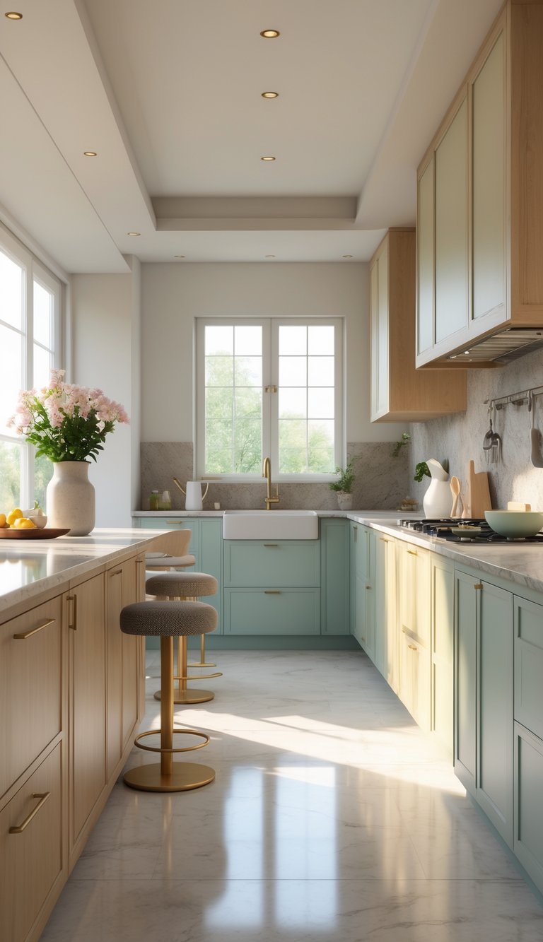
I’ll walk you through practical factors to consider, from classic neutrals to 2026 trends like sage and warm taupe, and show how two-tone schemes or natural wood can work in your layout. Expect simple tips on matching hardware and countertops so the final look feels intentional and easy to live with.
By the end, you’ll know which colors make small kitchens feel larger, which hide fingerprints, and how to pick a tone that will still feel right years from now.
Understanding the Importance of Kitchen Cabinet Color
The right cabinet color affects how the kitchen looks, how it feels to use, and how buyers see your home. It guides light, pairs with countertops and floors, and sets a mood you live with every day.
Impact on Kitchen Style and Ambiance
I pick cabinet color first because it sets the room’s style. Light colors like soft white or warm greige make a small kitchen feel larger. Dark tones such as navy or charcoal add depth in a large, well-lit kitchen or when used on an island for contrast.
Finish matters as much as hue. Satin or semi-gloss holds up to daily cleaning better than flat paint. Two-tone layouts, dark lowers and light uppers, help define work zones and add visual interest without heavy remodeling.
Think about fixed elements. I always match cabinet color to countertops, backsplash, and flooring samples in natural light. This avoids clashing tones and keeps the space cohesive during a kitchen renovation.
Resale Value and Design Longevity
I consider resale when choosing a cabinet color, especially if you plan to sell within 5-10 years. Safe, neutral tones like warm whites, greige, and soft taupe appeal to the widest range of buyers and keep renovation costs manageable.
If you want personality, I suggest limiting bold color to the island or lower cabinets. That preserves resale appeal while letting you enjoy a trend. Durable finishes and easier-to-clean colors reduce long-term maintenance, which buyers notice.
When replacing cabinets isn’t needed, repainting or refacing gives a modern look without full replacement. I recommend testing samples on-site and photographing them at different times of day to judge how the color will age and hold value.
Color Psychology in Kitchen Spaces
I choose color with how people use the kitchen in mind. Warm neutrals create a calm, welcoming atmosphere good for family cooking. Greens like sage feel restful and connect to natural materials such as wood floors.
Blues and deep teals can feel elegant and steady, but in small, dim kitchens they may feel heavy. Black or charcoal brings a modern, grounded feeling when balanced with lighter walls and bright lighting.
Practical habits matter. Busy households benefit from mid-tone colors that hide wear and fingerprints. I always test samples and live with them on a cabinet door for a week to see how they affect mood and daily life.
Key Factors to Consider Before Choosing a Cabinet Color

I focus on the practical things that change how a cabinet color looks and lives in your kitchen: size and layout, light sources, what your countertops and floors already are, and how the color fits the rest of your home.
Kitchen Size and Layout
Start by measuring sight lines and the main work zones. In a small galley or 8×8 kitchen, light cabinet paint colors like soft cream, pale sage, or warm off-white help the space feel open. I often recommend white upper cabinets with a slightly darker base to keep walls airy while adding depth at eye level.
In larger, open-plan kitchens you can use darker shades, navy, charcoal, or stained wood, without closing the room in. If you have a big island, treat it as a focal point: paint the island a contrasting color to anchor the layout. Think about cabinet placement too; continuous runs of dark cabinets make long walls feel heavier, so break them with glass fronts or open shelving.
Natural and Artificial Lighting
Note the direction your main windows face and the hours of direct sun. North-facing kitchens get cooler light, so I steer clients away from icy whites and blues; warm creams or soft beige work better. South- and west-facing rooms receive warm light that flatters bright whites and mid-tone colors.
Also map your artificial light: recessed lights, pendants, and under-cabinet strips change perceived color at night. Test paint samples on cabinet doors and view them at noon and after dinner. A swatch next to white countertops or marble countertops will show how undertones shift under warm bulbs versus daylight.
Existing Features: Countertops, Backsplash, and Flooring
Identify the dominant surface patterns and undertones. If you have white countertops or marble countertops with gray veining, cool neutrals like dove gray or soft blue-green complement the stone. Warm-toned quartz or butcher block usually pairs better with cream, taupe, or olive-green cabinet paint colors.
Match finishes as well as hues. Glossy painted kitchen cabinets reflect more light and read lighter than matte finishes. If your backsplash has busy tile, pick a calmer cabinet color to avoid visual competition. For flooring, dark stained hardwood can handle lighter upper cabinets, while pale floors often work well with richer base cabinets.
Matching Your Home’s Overall Style
Look at adjacent rooms and the home’s architectural details. In a traditional house, I advise warm creams, muted grays, or stained wood to keep a cohesive flow. In a modern layout, slab white or bold painted cabinets like deep blue feel intentional and current.
Think about resale too if you plan to sell within a few years. Neutral cabinet paint colors, soft white, warm gray, or classic cream, appeal to more buyers and still allow you to add personality with hardware or a painted island. If you love color, a two-tone scheme keeps main cabinets neutral while letting an island or lower cabinets show your style.
Popular Kitchen Cabinet Colors and Finishes in 2026

I’ll highlight the practical picks that homeowners choose now: warm neutrals that hide wear, nature-inspired greens that pair well with wood, and blues that make islands or lower cabinets stand out.
Timeless Neutrals: Whites, Creams, and Grays
White kitchen cabinets still work when you want a bright, clean look. I prefer warm whites and creams over stark bright white because they hide fingerprints and look better with natural wood floors. If resale value matters, white kitchen cabinets remain a safe choice, buyers often expect them in smaller kitchens because they make spaces feel larger.
Gray kitchen cabinets have shifted to warmer gray-beige tones (sometimes called greige). These colors pair well with marble counters and brass hardware. For finishes, I recommend matte or low-sheen paint; they hide scratches and show less glare than high gloss. If you want contrast, use wood lower cabinets or a stained island to avoid a flat, monotone look.
Nature-Inspired Greens: Sage, Olive, and Deep Green
Sage green cabinets bring a soft, lived-in feel that works with white counters and oak floors. I like sage green kitchen cabinets for open-plan homes because they read as neutral but add calm color. Olive and deeper greens suit closed or private areas like a butler’s pantry, where bold color can be more adventurous without overwhelming the main kitchen.
For finishes, satin or eggshell paint highlights subtle wood grain and looks modern. Pair green kitchen cabinets with warm metals, aged brass or bronze, and with natural stone or wood countertops. These combos make the color feel intentional and grounded, not trendy.
Bold Blues: Navy, Cobalt, and Powder Blue
Blue kitchen cabinets are my go-to when homeowners want character without full remodel. Navy works great on lower cabinets or islands; it hides scuffs and gives weight to the room. Powder blue suits smaller kitchens or upper cabinets to keep things light. Cobalt can be striking in a pantry or on an island if you balance it with warm wood and neutral walls.
For finishes, use durable, semi-gloss paint on high-touch surfaces like island cabinets and lower runs. Match blue kitchen cabinets with brass or matte black hardware depending on how warm or cool you want the palette. Blue pairs well with white subway tile or veined stone for an enduring look.
Trending Cabinet Color Combinations and Styles
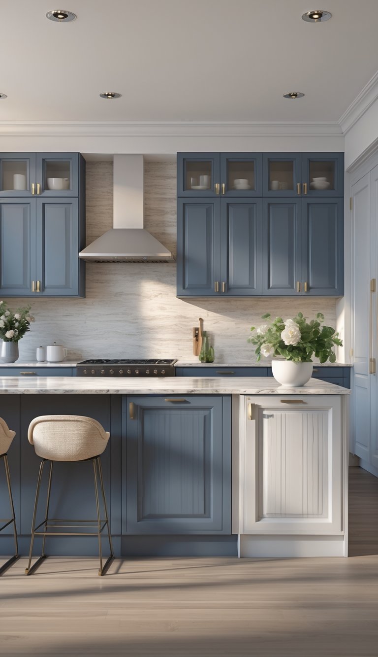
I focus on mixes that give clear visual structure, texture, and ease of maintenance. These options show how to balance contrast, warmth, and function without overcomplicating the kitchen.
Two-Tone Cabinets and Color Blocking
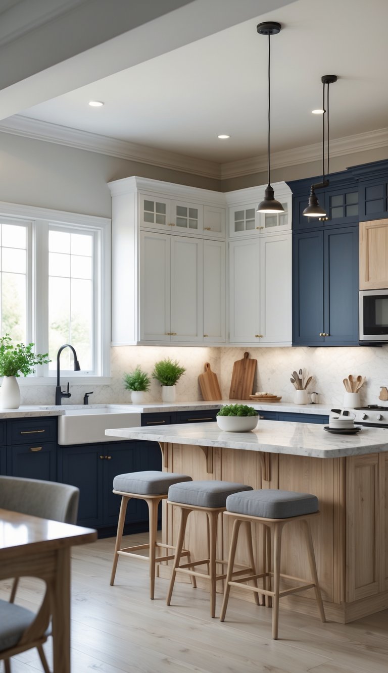
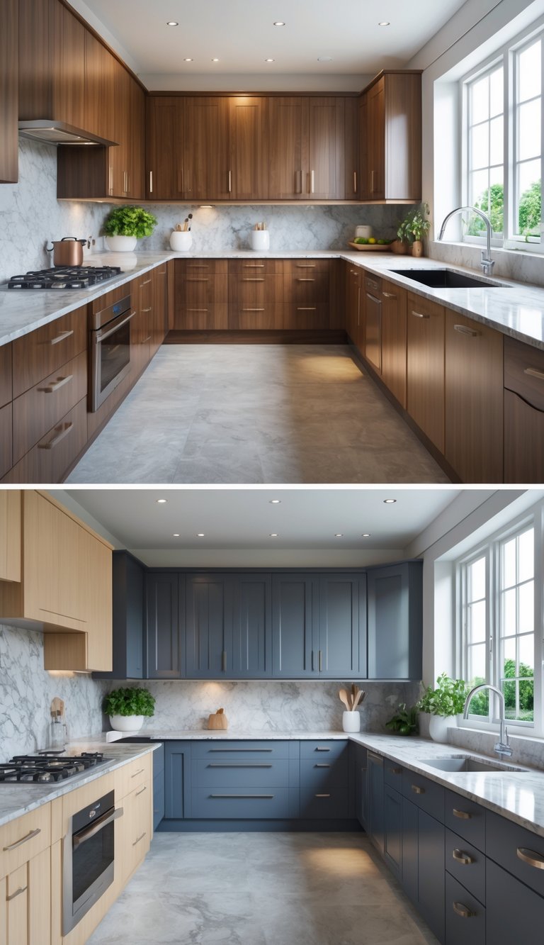
I recommend two-tone cabinets when you want a clear focal point without a full remodel. Use a darker color on lowers or the island (navy, deep green, or charcoal) and a warm off-white or cream on uppers. This keeps sightlines light while grounding the room.
Keep hardware consistent, matte black hardware or warm brass ties both halves together. Limit bold colors to one area to avoid a busy look. Two-tone cabinetry works well with a neutral countertop and a simple backsplash. For paint choices, pick colors with similar undertones so they don’t clash.
Mixing Natural Wood with Color
I often suggest pairing painted cabinets with natural wood accents for warmth and texture. Use painted upper cabinets in a soft neutral or muted green and a wood island or lower cabinets in oak or walnut. Reeded wood or open shelving adds depth without extra color.
Match wood tone to the room’s warmth: light oak with cooler paints; richer walnut with warm creams and olives. Keep finishes matte or satin to make the mix feel modern and lived-in. Use wood for high-touch areas like islands to hide wear and create a cozy focal point.
Dark Drama: Black and Charcoal Cabinets
I choose soft black or charcoal when clients want a bold, modern look. Black kitchen cabinets read as elegant, especially on islands or lower runs. Pair them with light, warm countertops and layered lighting to prevent the space from feeling closed in.
Matte black hardware complements black cabinets for a seamless look. Expect more visible dust and water spots; plan for durable finishes and good ventilation. Use dark cabinets with warm metals or wood to keep the mood inviting rather than stark.
How to Pair Cabinet Colors with Hardware and Countertops

I focus on three things: metal tone, contrast, and material match. Pick hardware that either contrasts the cabinet color or matches its undertone, and choose a countertop material that balances color and pattern.
Choosing the Right Hardware: Brass, Gold, Matte Black, and More
I pick hardware by thinking about temperature and visibility. For warm cabinets (oak, walnut, cream), brass or gold hardware warms the look and feels cohesive. Polished brass brightens a cream kitchen; satin gold adds a soft glow on stained wood.
For light or white cabinets, matte black makes a crisp modern statement and improves usability by making pulls easy to spot. Satin nickel or brushed stainless works well on cool greys and white if I want a low-contrast, sleek look.
Consider finish texture: brushed or satin hides fingerprints; polished finishes shine but show wear. Size matters too; use the 1/3 rule for pull length so the hardware looks balanced on drawers and doors.
Coordinating Cabinet Colors with Countertop Materials
I match cabinet color to countertop by weighing color and pattern. White countertops (quartz, solid-surface) pair with almost any cabinet color. With dark navy or deep green cabinets, white counters add bright contrast and keep the space from feeling heavy.
Marble countertops introduce veins that can tie together two cabinet tones; use a slab with subtle grey veining to link light grey cabinets and stainless or nickel hardware. For warm wood cabinets, choose warm-toned stone or quartz with soft beige or gold flecks; that helps brass or gold hardware feel intentional.
If your cabinets have strong color, pick a countertop with subtle patterning so it won’t compete. Conversely, plain cabinets let you choose a bolder countertop. Always test full-size samples under your kitchen light before you commit.
Timeless Tips for Choosing Your Perfect Kitchen Cabinet Color
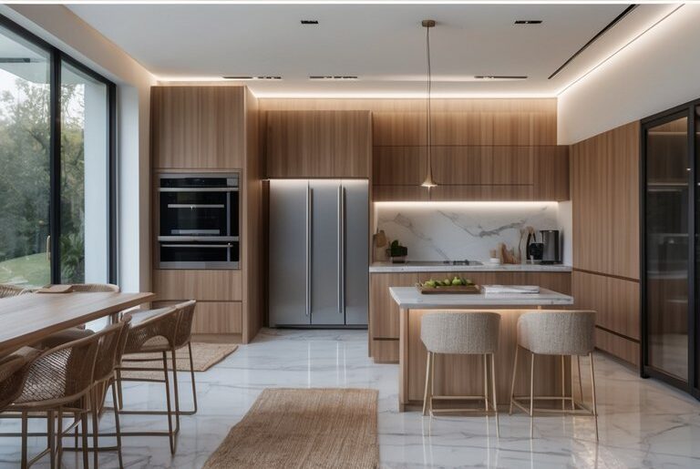
I focus on practical steps that help you pick a cabinet paint color that looks good day after day, fits your home, and stands up to daily life.
Testing Paint Swatches and Samples
I always start with real samples, not just digital photos. Buy 2–3 small jars of cabinet paint colors and paint 12–18 inch panels or a cabinet door. Place samples on different walls and view them at morning, midday, and under your kitchen’s artificial lights. Light changes color more than you think.
Use glossy and matte finishes to compare sheen. Wipe a painted panel with a damp cloth to check stain resistance for high-traffic spots. Label each sample with the brand and formula so you can match touch-ups later. Take photos, but trust your eyes in the room for final decisions.
Balancing Trends with Personal Style
I weigh trends against how you live in the space. If you like current ideas like sage green or navy blue, use them where they’re easy to change; an island, open shelving, or lower cabinets. For long-lasting choices, pick neutrals like off-white, taupe, or warm grey for the main run of cabinets.
Think about hardware, countertops, and flooring before committing. Bold colors work best when paired with neutral counters and simple backsplashes. Ask yourself how long you’ll live with the color and whether it fits the rest of your home’s palette.
Expert Advice for Lasting Satisfaction
I recommend testing durability and maintenance before full repainting. Choose cabinet paint labeled for cabinets or trim; these formulas resist scuffs and clean more easily. Ask your painter about the right primer and topcoat; proper prep prevents peeling.
If you want a big change without full replacement, I suggest replacing doors or doing a two-tone scheme: neutral uppers and a richer color on the island or base cabinets. Finally, get a small professional mock-up or consult a color-savvy carpenter to confirm samples under real conditions. Small tests save big headaches later.
Frequently Asked Questions
I answer common color questions based on light, room size, countertops, and current trends. Read the short Q&As to help you pick a cabinet color that fits your kitchen and lifestyle.
What are the trending kitchen cabinet colors for 2026?
In 2026 I see warmer, nature-inspired tones gaining traction. Think olive greens, warm terracotta, deep forest green, and rich navy.
Earthy greys and creamy off-whites remain popular for people who want a softer look. Many homeowners choose a bold shade for an island and a calmer neutral for the rest.
How can I choose the right cabinet color to match my kitchen’s decor?
Start by looking at your countertops, backsplash, and flooring. Pick a color that ties into one of those elements to create a cohesive look.
Consider the room’s light. South- or west-facing kitchens can handle darker tones. North-facing or small kitchens often work better with lighter shades to keep the space bright.
Which neutral colors are best for kitchen cabinets?
Creamy whites, warm greige, and soft taupe are safe neutral picks I recommend. They balance warm wood floors and a range of countertop materials.
Light grey and beige work well when you want subtle contrast with stone counters. Choose the neutral with an undertone that matches your fixtures and flooring.
What are some popular kitchen cabinet color combinations?
A common combo I recommend is deep navy lower cabinets with off-white uppers. It adds depth without feeling heavy.
Another favorite is sage green on the island with warm white perimeter cabinets. Dark wood lower cabinets paired with light upper cabinets also give a classic, grounded look.
How does using a kitchen cabinet color visualizer help in selecting the right shade?
A visualizer lets you upload a photo of your kitchen and try colors digitally. I use them to see how hues change under your actual lighting and next to your counters.
They won’t replace paint samples, but they save time and narrow your choices before you test real swatches.
What factors should I consider when picking a kitchen cabinet color?
Consider natural and artificial lighting, kitchen size, and the undertones of nearby surfaces. Those elements change how a color reads in your space.
Also think about resale value, how long you want the color to feel fresh, and whether you prefer easy to update accents like an island or hardware.