How to Choose Bedroom Color Palette: Complete Guide (2026)
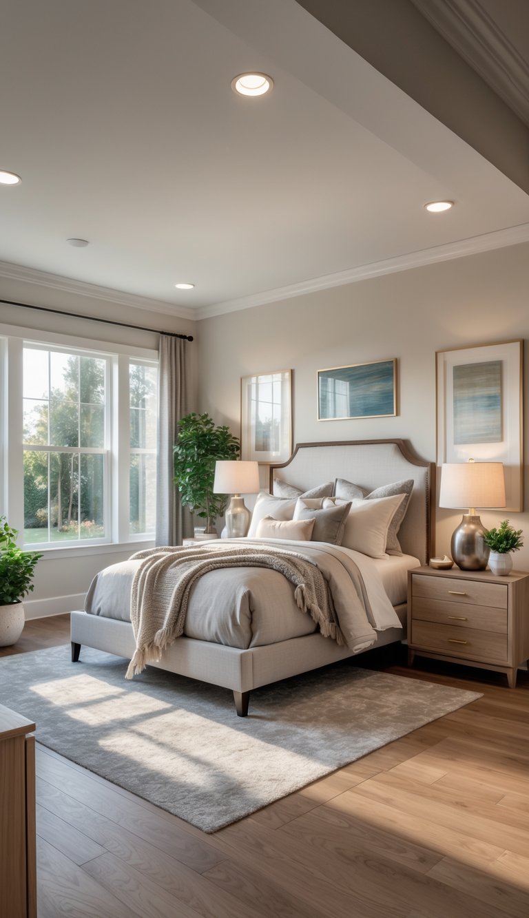
Choosing the right bedroom colors can totally change how you feel in your space. Think about the vibe you want—calm, cozy, or energized—and pick a main color, a complementary shade, and one accent to tie things together. A simple palette with a dominant color, a softer supporting color, and a bold accent keeps things balanced and makes decisions way easier.
You’ll learn how colors affect mood, how light and room size can change the look of your paint, and how to test colors before you commit. Follow these steps to map your space, compare color schemes, and use digital tools to see your palette in your actual room—no more expensive mistakes.
1. Understanding Color Psychology for the Bedroom
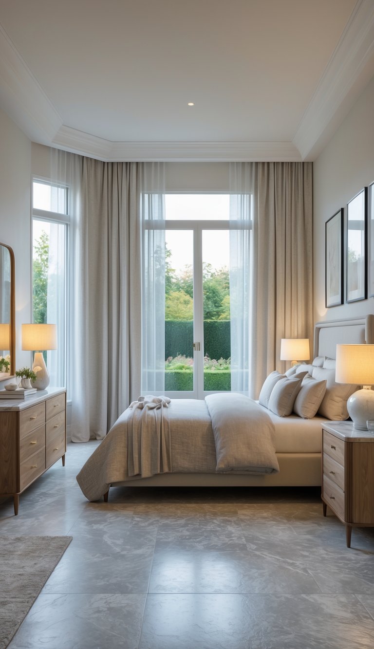
Colors really do affect how you feel and how your space looks. Pick shades that relax you, work with your lighting, and go with your furniture for better sleep and comfort.
The Role of Color in Mood and Sleep
Color impacts your nervous system and can help or hurt your sleep. Cool tones like soft blue slow your heart rate and make it easier to wind down. Warm tones like peach or muted terracotta add coziness, but super-bright warm shades might be too energizing for bedtime.
Light level is key. Dark navy soaks up light and can make a big room feel snug and calm. Pale colors bounce light around, keeping small rooms airy. Always test paint on your wall and check it both day and night to see the real effect.
Use color on walls, bedding, and accents. A calm wall color with richer accents adds depth without being overwhelming. If you want better sleep, keep wild patterns and high-contrast combos away from your bed area.
Psychology of Color in Bedroom Spaces
Different colors trigger different feelings. Blue is calming and trustworthy; green feels balanced and brings in a bit of nature; gray and beige are neutral and steady; and soft lavender can help lower stress. Skip super-saturated reds or neon shades near where you sleep—they can ramp up your heart rate and make you feel more awake.
Finishes matter, too. Matte paint softens color and cuts down on glare, making it easier to relax. Satin or glossy finishes bounce light and feel more lively. Think about how your floors, curtains, and bedding play off your walls to keep the mood consistent.
Personal history counts. If you grew up with certain colors, those will probably feel safe and familiar. Always test how a color actually makes you feel in your room before you go all in.
Choosing Colors Based on Desired Atmosphere
Pick the main feeling you want: calm, cozy, uplifting, or focused. For calm, go for muted blues, soft greens, or warm neutrals. For cozy, try warm neutrals, soft browns, or gentle terracotta. If you want a space that’s both energetic and restful, start with a neutral base and add an accent like soft coral or mustard.
Build your palette in three layers: dominant wall color, a secondary tone for furniture or big textiles, and an accent for pillows and art. For example: pale gray walls, deep green curtains, and mustard throw pillows. This keeps things balanced and avoids overstimulation.
For more on how color affects mood and sleep, check out this guide on bedroom color schemes.
2. Assessing Your Bedroom Space
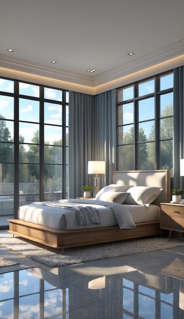
Start by measuring your room and noting the light sources, where your furniture sits, and the color of your floors. These details help you pick the right color scheme and save you from repainting later.
Evaluating Room Size and Layout
Measure length, width, and ceiling height. Smaller rooms feel bigger with lighter paint colors like soft gray, pale blue, or warm beige. Dark shades can still work—just use them on a feature wall or in a bigger, brighter room.
Watch out for architectural quirks: alcoves, built-in closets, and window spots all change how color looks. Lighter ceiling paint or vertical stripes make low ceilings seem taller. Place big furniture where it doesn’t block views—your main pieces will affect which colors feel balanced.
Think about what you do in the room. For a sleep sanctuary, stick with muted tones for walls, bedding, and rugs. If you work in your bedroom, add a contrasting accent color to set that zone apart.
Considering Natural and Artificial Lighting
Check your light at different times: morning, midday, and night. Natural light shifts color temperature—north-facing rooms can look cooler, so warm palettes work better there. South-facing rooms get warm light, so blues and greens stay truer in those spaces.
Test paint samples on big poster boards and move them around the room. Look at them under daylight and your usual lamps. Your bulb choice matters: warm LEDs (2700–3000K) make warm paints richer, while cool LEDs (4000K+) make blues and grays look crisper.
Glossy finishes reflect more light, which can get annoying. Matte or eggshell sheens keep things soft. Place lamps and mirrors to control how light bounces and how your paint looks at night.
Aligning with Existing Furniture and Décor
Take stock of your big pieces: wood tones, metals, and fabric colors. Match paint undertones to your main items—warm undertones with honey or walnut, cool undertones with ash or gray. Pull a color from your rug or art for your accent to tie things together.
Try the 60-30-10 rule: 60% dominant wall color, 30% secondary (like furniture or curtains), 10% accent (pillows, lamps). This keeps your color scheme balanced. If you have bold patterns, pick a neutral wall color that works with the main color in your pattern.
If you want a new look but don’t want to replace furniture, paint one wall or update your textiles first. It’s a low-commitment way to try a new palette while keeping your favorite pieces.
3. Exploring Bedroom Color Schemes
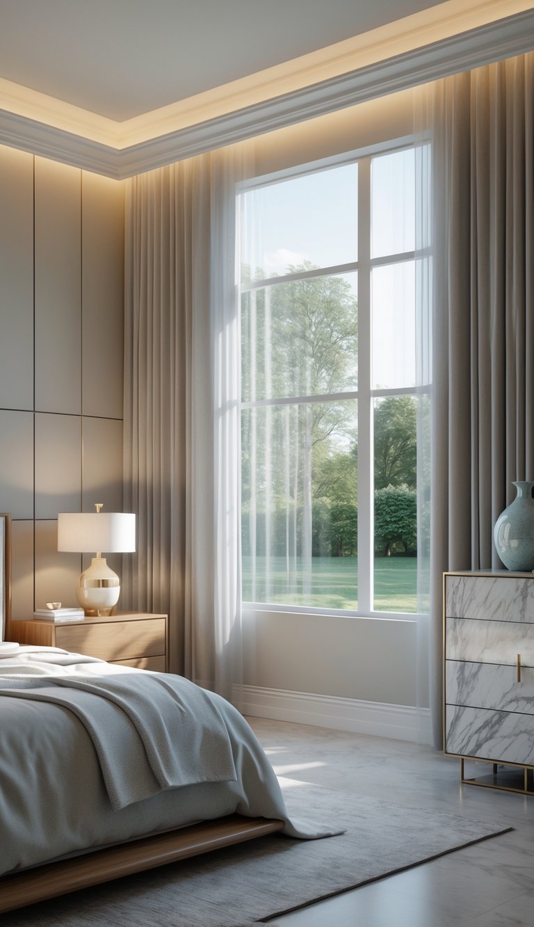
Pick colors that match the mood you want and how you use the room. Balance your walls, bedding, and accents for a pulled-together look that’s easy to live with.
Classic Neutrals
Neutrals like soft white, warm beige, and light gray make your room feel calm and open. They reflect light, so they’re great for small bedrooms or spaces with not much sunlight.
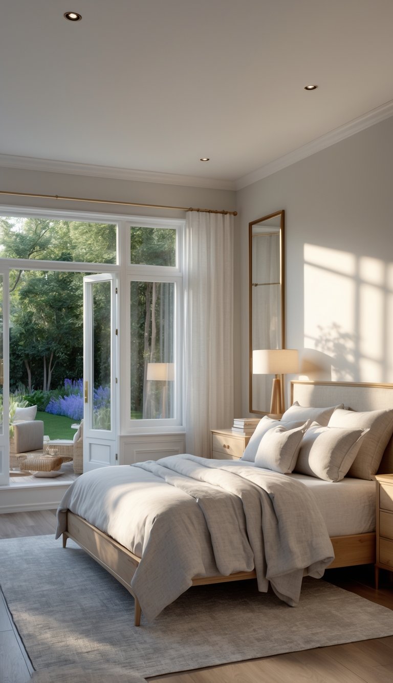
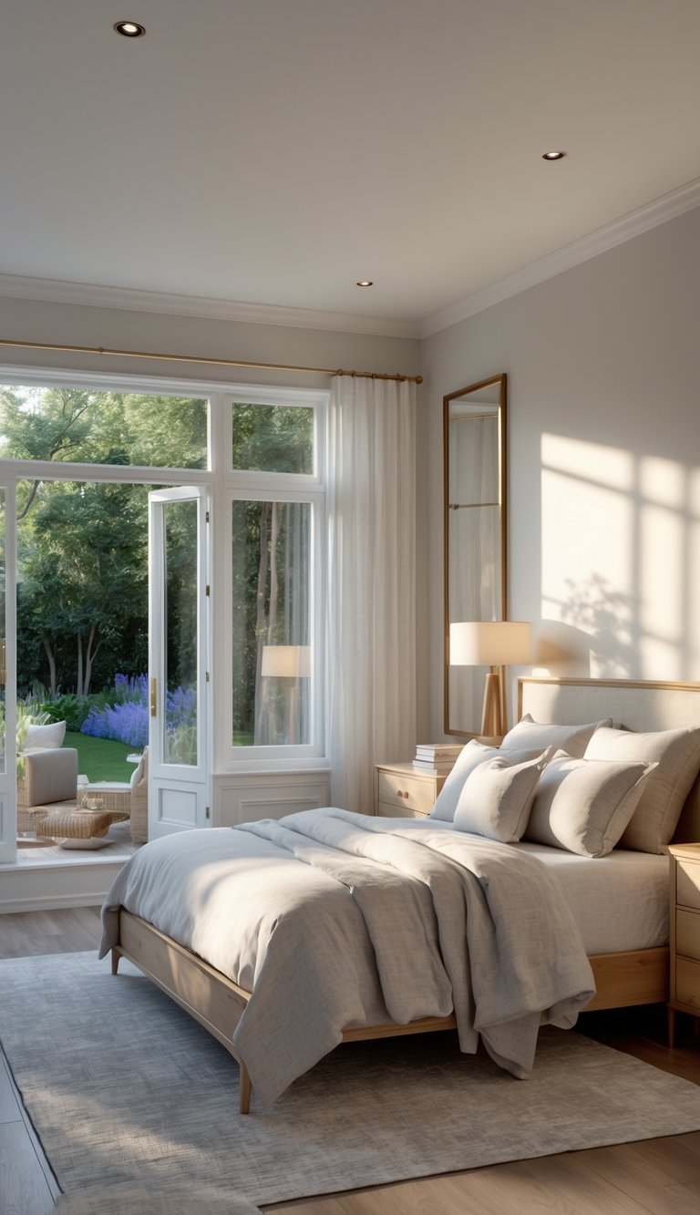
Use neutrals as your base and layer in texture—linen bedding, a wool rug, or matte wood—so the space doesn’t feel flat. This also makes it easy to swap out accent colors with the seasons.
- Walls: light gray or warm white
- Trim: crisp white
- Accents: tan leather, raw wood, or muted greens
For a cozy vibe, go with warmer neutrals. For a modern feel, try cool grays and add a little black metal or glass. Test swatches on different walls and check them in both morning and evening light.
Bold & Vibrant Combinations
Bold schemes use strong colors like navy, emerald, or terracotta for the main wall or a statement piece. Stick with one bold color and balance it out with a couple of neutrals to keep things from getting too wild.
- Dominant color: 1 (walls or a big piece)
- Secondary colors: 1–2 (bedding, curtains)
- Neutrals: base for balance
Navy pairs well with warm wood and brass for a luxe feel. Terracotta looks great with cream and olive for an earthy vibe. Always test a small painted area and bring in your textiles before you commit.
Monochromatic and Analogous Palettes
Monochromatic palettes use one color in a few shades—light, medium, and deep—to add depth while keeping things cohesive. Mix up textures and finishes: satin pillows, matte paint, glossy ceramics.
Analogous palettes use colors next to each other on the wheel, like blue-green and teal, for a chill, harmonious look. Pick your main color, then use the neighbors as accents and trim. This keeps contrast low and the space feeling unified.
- Monochrome: mix 3–4 shades and layer in different textures
- Analogous: pick one main color and two accents
- Add a contrasting accent (like metallic or warm wood) to keep it interesting
Both these approaches are perfect if you want a calm, coordinated bedroom without sharp contrasts.
4. Using Complementary Colors and Accent Walls
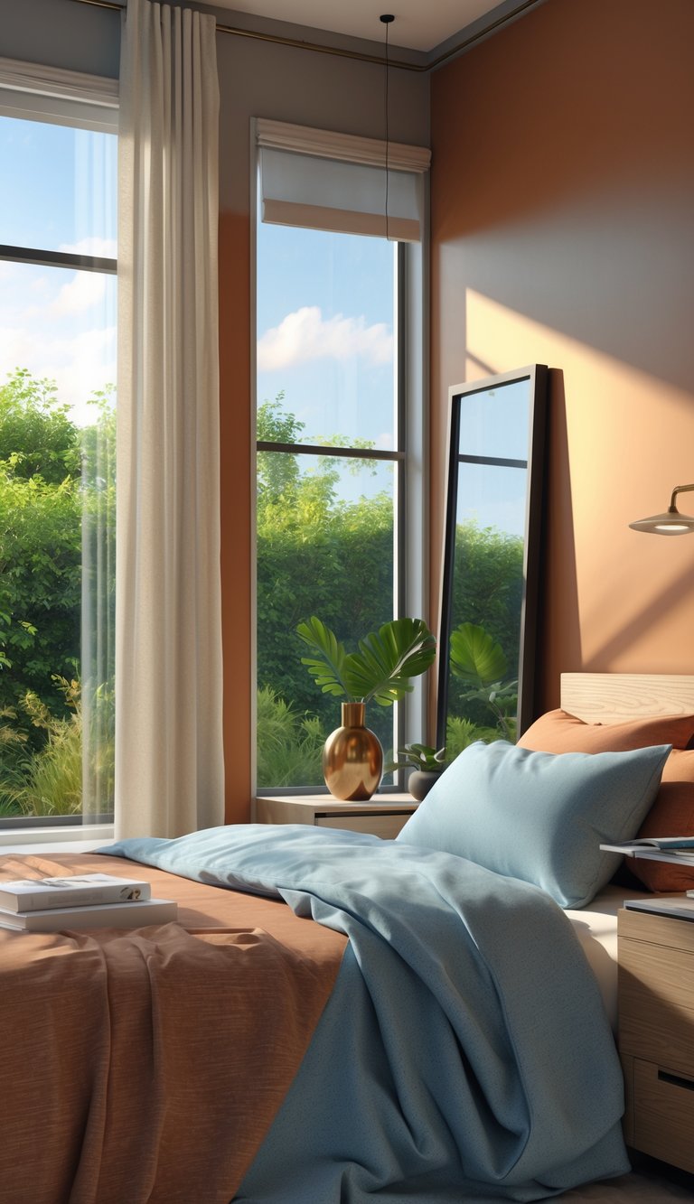
Picking one strong main color and a balancing accent gives your bedroom energy and structure. Use the color wheel to find opposites, then choose which will be your main color and which will be the pop.
Finding Complementary Color Pairings
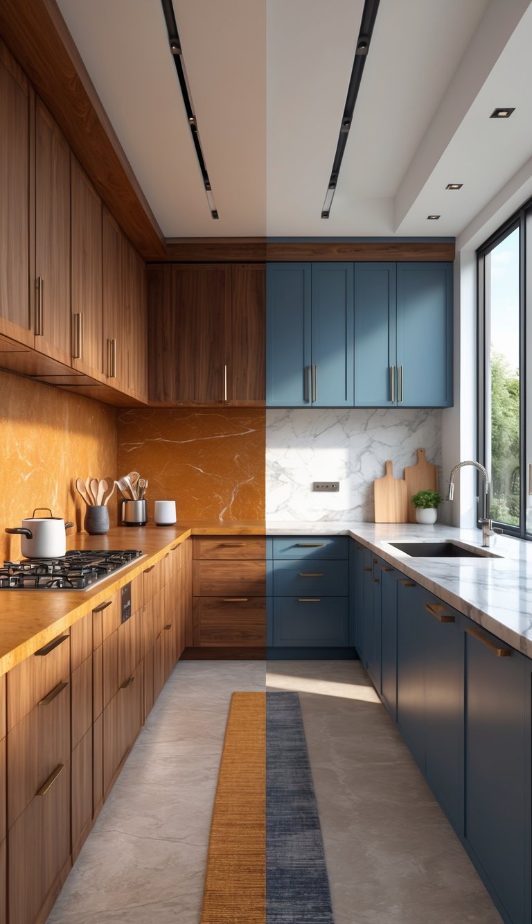
Complementary colors are opposites on the color wheel—like blue and orange, red and green, or yellow and purple. Go with a dominant color for your walls or a big piece of furniture, and use its opposite in smaller touches: pillows, a rug, or art.
Test paint chips in your room’s light. If your walls are a cool blue, pick a muted warm orange or rust instead of a neon orange to keep things chill. Use the 70/30 rule: 70% dominant color, 30% accent and neutrals. Add one neutral (white, gray, or beige) to soften the look and avoid making the room feel too loud.
Try out complementary accents with fabrics and small decor before painting. It’s an easy way to get a feel for the mood without a big commitment.
Incorporating Accent Walls for Depth
An accent wall is a great way to spotlight a bold color without taking over your whole bedroom. Try painting the wall behind your headboard or the one opposite your window in your chosen accent shade—it’ll draw the eye and give the room some structure.
Keep the other walls in a softer version of your main color or a coordinating neutral. For example, pair a deep teal accent wall with gentle gray-blue walls for a look that feels pulled together.
Play with finishes: matte paint for a chill vibe, eggshell for a little glow, or textured wallpaper if you want some pattern. Always test a big swatch on your wall and check it out at different times of day—light can totally change how a color looks.
Let your main furniture and bedding echo the dominant color, and cluster accent pieces like lamps, pillows, or art near your accent wall to keep things feeling cohesive.
Color guides from brands like Benjamin Moore are handy for finding complementary combos and seeing real-life examples.
5. Selecting and Testing Paint and Color Palettes
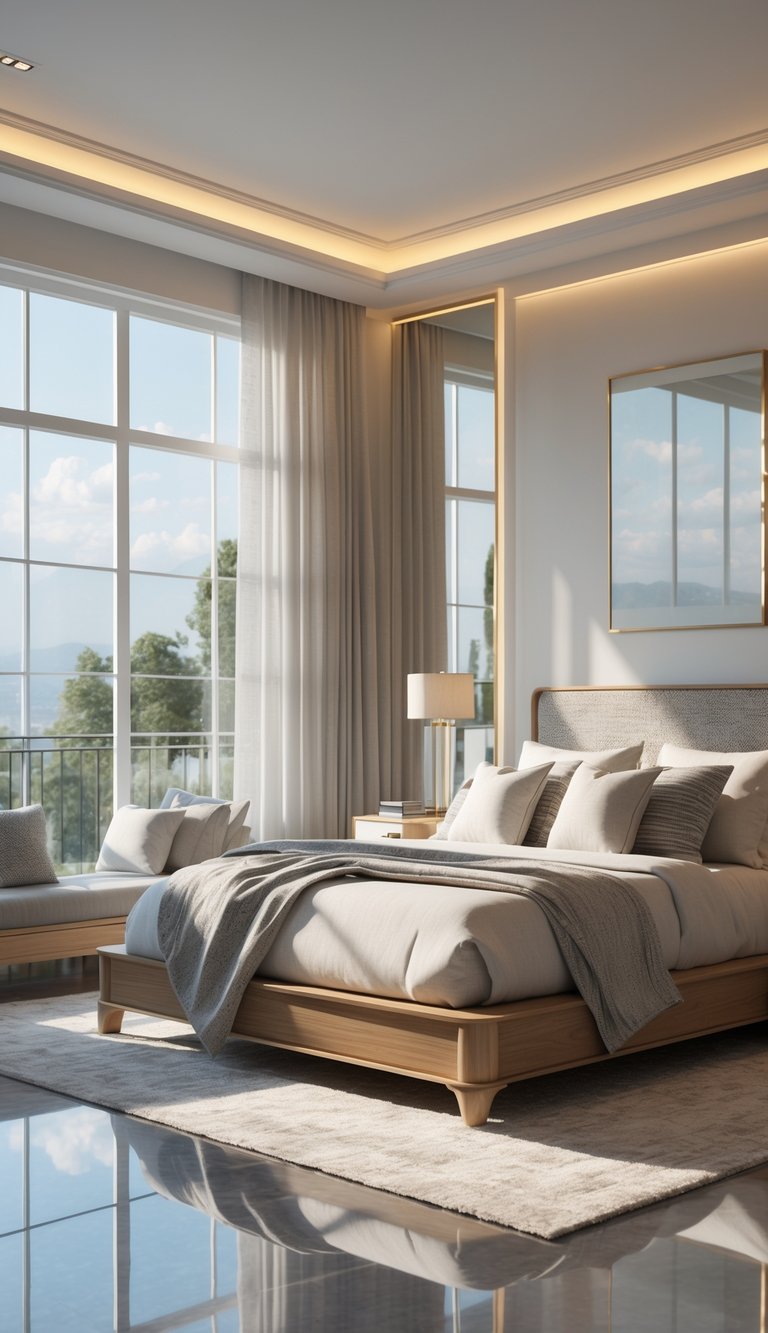
Always test paint on your actual walls and try to arrange your colors so one is dominant, one supports, and one pops as an accent. Pay close attention to how paint looks in your space throughout the day and with your furniture in place.
Utilizing Paint Samples and Swatches
Grab sample jars or peel-and-stick swatches in at least three shades from each color family you’re considering. Paint 12-inch squares on a few different walls—don’t just stick to one spot. You’ll see how the color shifts with sunlight, lamps, and shadows from your furniture.
Check out your samples over a few days, especially in the morning and evening. Snap photos so you can compare. If something feels off—too flat, too cool, or just blah—try a warmer or more saturated version.
Layer fabric and curtain swatches on top of your painted samples to see how everything works together. Label each test spot with the paint brand, color, and finish so you can easily get more later.
Applying the 60-30-10 Rule for Balance
Pick one color to cover about 60% of the room—usually your walls or biggest furniture. This should be a calming, dominant shade that makes the space feel pulled together.
Use about 30% for secondary colors—think bedding, curtains, or an accent wall. These add depth without stealing the spotlight. The last 10% is for bold accents: pillows, lamps, or art that really pop.
Here’s a quick checklist:
- 60% dominant: walls or large furniture
- 30% secondary: textiles and medium pieces
- 10% accent: small decor and trim
Step back and look at your room from the doorway—if one area grabs too much attention, shuffle your accents or swap out a textile to get the balance right.
6. Leveraging Color Palette Tools and Inspiration
Online tools make it easy to play with palettes using photos of your actual room. Look for generators that let you lock in favorite colors and export hex codes. Pair these with inspiration pics to find a combo that works with your lighting and furniture.
Popular Color Palette Generators
Try a tool like Coolors for instant palettes and hex codes so you can match paint and fabrics exactly. You can lock colors, tweak brightness, and export palettes for sharing with your painter or designer.
Handy features include photo uploads (to pull colors straight from a room), contrast checks, and easy export options. Some generators let you save palettes so you can compare warm and cool versions side by side. If you’re always on your phone, check if the tool has an app.
Finding Color Inspiration Online
Browse design galleries and mood boards for real bedrooms that match your style and lighting. Save images with wall paint, bedding, and wood tones together so you can see how colors work in real life. Use search terms like “bedroom color palette” plus words like “cozy” or “minimal.”
When you find a look you love, upload the image to a palette generator to grab the exact colors. Narrow it down to 3–5 favorite palettes and test them on a photo of your space to see what works best. For more curated ideas and designer tips, check out this guide on choosing a home color palette.
Frequently Asked Questions
Here are some quick, practical answers to common bedroom color questions—covering light, mood, furniture, and trends.
What factors should I consider when selecting colors for my bedroom walls?
Start with your natural light. North-facing rooms do better with warmer colors, while south-facing spaces can handle cooler tones.
Check your furniture and floors—match warm woods with warm paint, cool grays with cool colors. Think about the mood you want: muted shades for calm, brighter pops for energy.
Which colors are traditionally known for enhancing sleep quality?
Blues are classic for calm—they help lower heart rate and quiet your mind. Dusty blues are great for adults.
Greens, like sage or muted olive, bring balance and restfulness, especially on an accent wall.
Warm neutrals like beige and soft gray keep things cozy. Avoid super bright or high-contrast colors right by the bed.
How do I create a calming color scheme suitable for adult bedrooms?
Pick a soft neutral or muted color for the walls—think gentle gray or warm beige. Add a secondary color that’s just a bit lighter or darker for depth.
Use an accent color sparingly on pillows, art, or one wall. Stick with natural textures and matte finishes to keep things relaxed.
Always test paint in your room at different times of day before you decide.
What are the most popular color palettes for couples’ bedrooms?
Layered neutrals are super popular: warm beige, soft gray, and cream make a great foundation.
Blue and green combos are also a hit—dusty blue with sage is especially calming. If you want something bolder, try deep navy with blush or terracotta accents.
Balance is key: one partner’s favorite can be the accent, the other’s choice can anchor the main walls.
Can you suggest ways to match my bedroom color scheme with my overall home decor?
Pull a color or two from nearby rooms for a sense of flow. Repeat a trim or accent color in bedroom accessories or curtains.
Keep finishes—like metals, woods, and fabrics—consistent with the rest of your home. Rugs and art are great for bridging different palettes between spaces.
At least one neutral element, like white trim, helps tie it all together.
What are the latest trends in bedroom colors for contemporary home design?
Earthy tones and muted greens are still a go-to for creating a relaxing vibe—think olive, sage, and clay. These shades bring a bit of nature indoors and help keep things feeling peaceful.
If you want something a little bolder, deep colors like charcoal or navy are making waves, especially on accent walls or even ceilings. Warm neutrals paired with touches of soft pink or terracotta are also showing up in lots of modern bedrooms.
Matte and low-sheen finishes are the way to go, keeping the overall look soft and soothing.
Wrapping up, today’s bedroom color trends are all about comfort and personality. Whether you prefer calming greens or dramatic darks, there’s a stylish option to match your taste. For more inspiration, check out examples on Architectural Digest.
Conclusion
Choosing the right color palette for your bedroom doesn’t have to be overwhelming. Start with your room’s natural light, test out real paint samples, and use the 60-30-10 rule to keep things balanced. Online tools and inspiration galleries can help you visualize your options, while a few well-placed accents will give your space personality. With a little planning and some testing, you’ll land on a bedroom color scheme that feels just right for you.